UPDATE (5 Nov 2025)
After comparing notes with a few coworkers who also recently updated to macOS Tahoe I realized that the UI glitches detailed below were, most likely, the result of a botched installation on my machine, because no one else was experiencing the same issues. Good news: All of the issues presented below have been fixed on my machine by installing macOS Tahoe 26.1 and I am very relieved.
According to the press release macOS Tahoe 26 comes with a "gorgeous new design" called "Liquid Glass". What follows is a brief experience report, a phrase which here means a desparate cry for help from anyone at Apple that might see this (highly unlikely) and have pity on me (even less likely).
I installed Tahoe just a few days ago and immediately missed the way everything looked and felt before. I've messed with the accessibility settings to reduce motion and transparency and increased contrast, which fixed many of the problems. Then, after using the computer for only a day I was greeted with several situations that truly shocked me--situations that presented me with a dialog or UI element that was rendered mostly or even completely unreadable because of its transparent nature. These scenarios seemed to defy the aforementioned accessibility settings so maybe these are just bugs that will soon be fixed--yeah, let's go with that. I'll just finish this introduction by mentioning that in all of the following screenshots I had the display set to 'dark' mode.
Exhibit A: The "Control Center" in front of a web page with a light background
Doesn't really inspire a sense of control, does it...
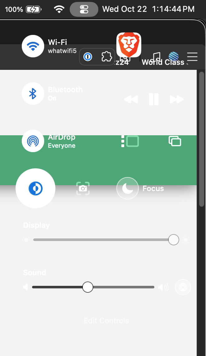
Exhibit B: The "Autoupdate" dialog in front of a small progress bar element
It's difficult to discern what text goes with which element.
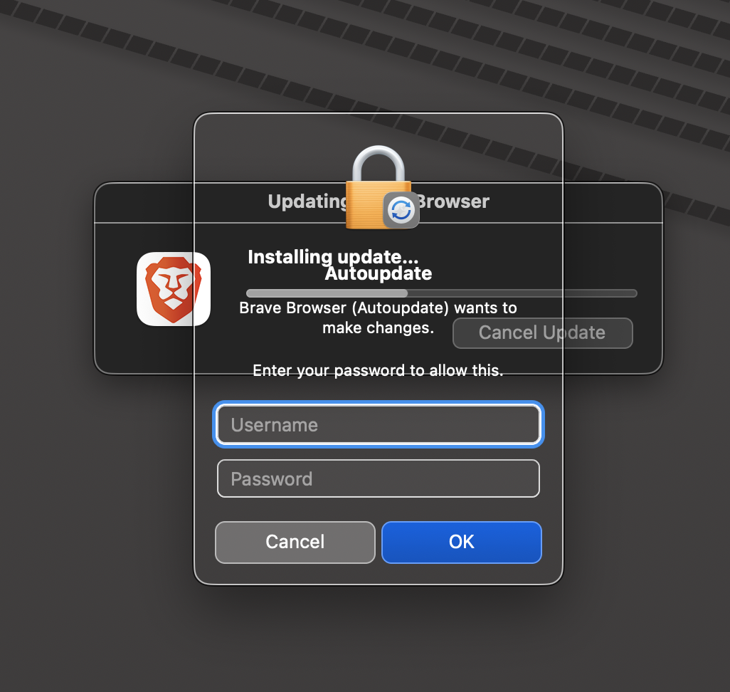
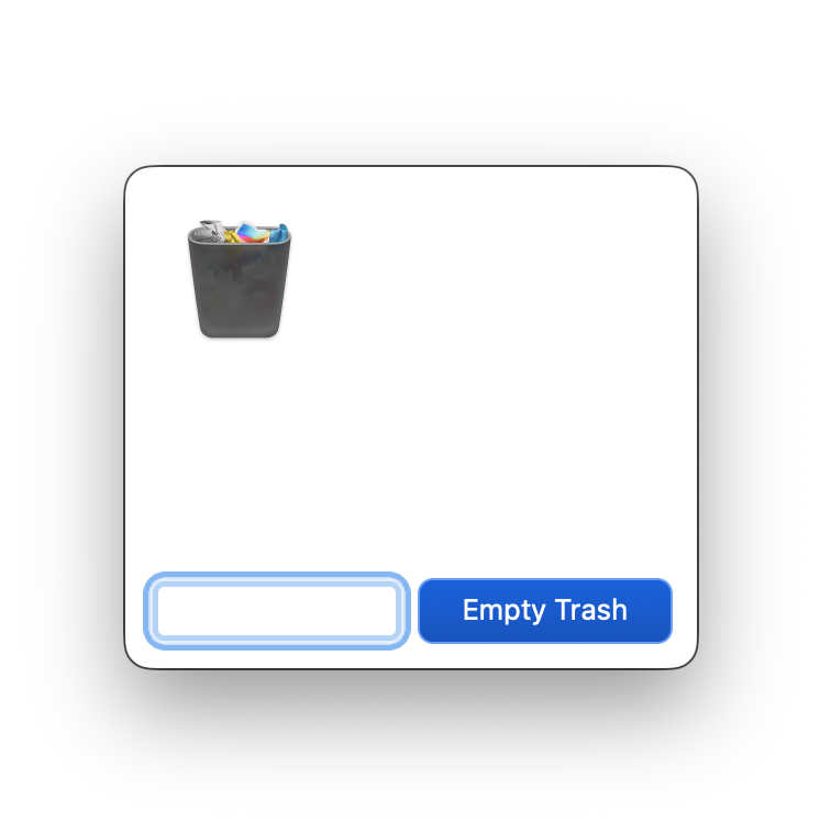
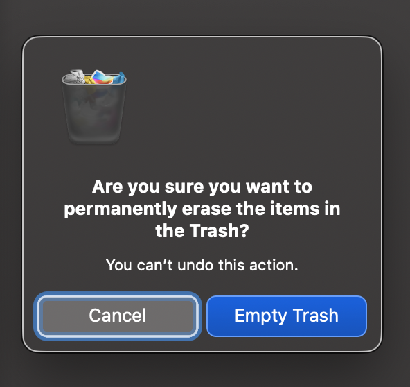
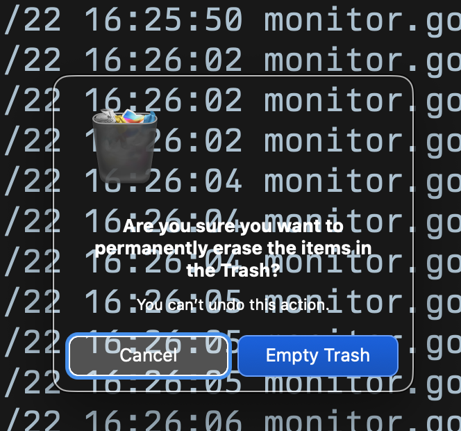
Exhibit C: The "empty trash" dialog in front of various different backgrounds
I have no words (and apparently neither does this dialog).
Apparently, it does have words but only in front of a darker background.
New macOS best practice: Avoid using the middle 30% of your screen to allow for the appearance of OS dialogs.
Now, as a software engineer I've been responsible for botched releases and I am deeply aware that no one is perfect. Honestly though, how did this release pass QA?
¯\_(ツ)_/¯
Someone on X put it quite bluntly:
Steve Jobs would have fired everyone
Though I might not condone Steve Jobs' management style, I tend to agree with that assessment.